How to Use React in the Umbraco Backoffice

Umbraco V14 introduced a step change for devs creating customisations in the Umbraco Back-office. Version 13 and below use Angular for custom back-office components, but from v14 onwards this changed to Web Components. The recommendation from Umbraco is to use these in combination with wrapper library Lit, and front end build tool Vite. If, like me, you already use tools like Webpack and React, then learning yet more front-end tech might not be desirable or practical when you have tight deadlines.
If you are looking for an alternative approach for building Umbraco Backoffice Components and Sections using Webpack and React, this article is for you.
The following steps explain how to use React to build custom Umbraco Backoffice customisations for v14 onwards:
- Add a custom Section to Umbraco back office (v14, 15 and 16).
- Configure Webpack build to build Javascript & css files.
- Create a wrapper Web Component to house React.
- Set up a basic React Component for the back-office section.
- Get Productive!
Add Custom Umbraco Back Office Sections in V14 Onwards
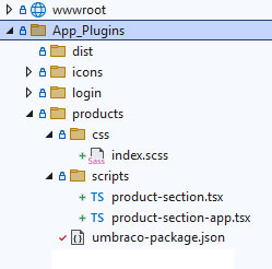
Adding a custom Section to the Umbraco back office got a lot easier in v14, 15 and 16, and is done by adding an umbraco-package.json file into a new folder within the App_Plugins folder. In this example, we are going to create a new Section called Products, and add a simple React grid component using the excellent MUI.com Data Grid Component.
In this example, we are creating our custom section using React and Typscript, so go ahead and create a new folder called products within the App_Plugins folder, adding a file called umbraco-package.json. At the same time, create two sub-folders - /css and /scripts.
In the /css folder, create an index.scss file (to hold the component css).
In the /scripts folder, create a product-selection-app.tsx file for the Web Component wrapper, and a product-section.tsx file for the React component.
Copy and paste the code below into the new umbraco-package.json file:
{
  "name": "PSM Products Section",
  "alias": "PSM.Products",
  "extensions": [
    {
      "type": "section",
      "alias": "psmProducts",
      "name": "PSM.Products.Section",
      "weight": 100,
      "js": "/App_Plugins/dist/product-section-app.js",
      "elementName": "product-section",
      "meta": {
        "label": "Products",
        "pathname": "products"
      }
    }
  ]
}
Notice the reference to a JS file at /App_Plugins/dist/product-section-app.js, this is a file that we will build using Webpack, dropping it into a /dist folder at the location specified.
This approach means we can add multiple component folders in App_Plugins and have their own umbraco-package.json file reference .js files in the same /dist folder.
The weight of 100 means our new Umbraco back-office section will appear as the last in the list.
Configure Webpack for React
Step 2 to use React and Webpack for building custom sections in the Umbraco Backoffice involves configuring Webpack to build the typescript and scss files created in the previous step. For my Umbraco components I use a separate webpack.plugin.js config file to keep the front-end build separate to that of the Umbraco back-office.
Add the following webpack.plugin.js file in the root of your Umbraco website:
const { CleanWebpackPlugin } = require("clean-webpack-plugin"); // Cleans up after webpack https://www.npmjs.com/package/clean-webpack-plugin
const MiniCssExtractPlugin = require("mini-css-extract-plugin"); // https://webpack.js.org/plugins/mini-css-extract-plugin/ Extracts CSS from JS and bundles separately
const ForkTsCheckerWebpackPlugin = require('fork-ts-checker-webpack-plugin'); // Speeds up Typescript checking https://github.com/TypeStrong/fork-ts-checker-webpack-plugin
const autoprefixer = require("autoprefixer"); // Adds Vendor prefixes https://github.com/postcss/autoprefixer from CanIUse

const path = require("path");

module.exports = {
    mode: 'development',
    devtool: 'source-map',
    entry: {
        'product-section-app': './App_Plugins/products/scripts/product-section-app.tsx',  // Output File : Input File
    },
    output: {
        filename: '[name].js',
        chunkFilename: "[name].js",
        path: path.resolve(__dirname, './App_Plugins/dist'), // Main drop folder
    },
    resolve: {
        extensions: ['.tsx', '.ts', '.js']
    },
    module: {
        rules: [
            {
                test: /\.tsx?$/,
                exclude: /node_modules/,
                use: {
                    loader: 'ts-loader',
                    options: {
                        configFile: 'tsconfig.plugin.json'
                    }
                }
            },
            {
                // Build Website CSS (Loaders below processed last to first)
                test: /\.s?css$/i,
                use: [
                    {
                        loader: MiniCssExtractPlugin.loader
                    },
                    {
                        loader: 'css-loader',
                        options: {
                            importLoaders: 1,
                            sourceMap: true,
                            url: false // Switches off checks for urls of images referenced in scss
                        }
                    },
                    {
                        loader: "postcss-loader",
                        'options': {
                            'postcssOptions': {
                                plugins: () => [autoprefixer()],
                            },
                        },
                    },
                    {
                        loader: 'sass-loader',
                        options: { sourceMap: true }
                    },
                ]
            },
        ],
    },
    plugins: [
        new CleanWebpackPlugin(),
        new MiniCssExtractPlugin({
            filename: "[name].css",
            chunkFilename: "[name].css",
            ignoreOrder: false,
        }),
        new ForkTsCheckerWebpackPlugin(),
    ]
};
The key takeway from this file is the Entry Path points at the /App_Plugins/products/scripts/product-section-app.tsx file (the Web Component Wrapper), with the exit path being /dist/product-section-app.js, so the final .js file the umbraco-package.json file points at.
Create Wrapper Web Component for React
The third step is to add a Web Component for the custom Umbraco Section to act as a wrapper for the React component. The component instructs Webpack to process the .scss style file (via an import) and also pull in the React and DataGrid modules.
When Umbraco initialises the Web Component it triggers the connectedCallback method, which:
- Creates a div within the shadow dom that we attach our React component to.
- Adds a link to the component's .css file created during the Webpack build.
- Attaches the React component to the div created earlier.
Add the following code into your product-section-app.tsx file:
import React from 'react';
import ReactDOM from 'react-dom/client';
import App from './product-section';
import '../css/index.scss';

// For MUI DataGrid
import createCache from "@emotion/cache";
import { CacheProvider } from "@emotion/react";

class ProductSectionElement extends HTMLElement {
    constructor() {
        super();
    }

    connectedCallback() {
        const shadowContainer = this.attachShadow({ mode: 'open' });

        const wrapper = document.createElement('div');
        this.shadowRoot.appendChild(wrapper);

        const style = document.createElement('link');
        style.setAttribute('rel', 'stylesheet');
        style.setAttribute('href', '/App_Plugins/dist/product-section-app.css');
        this.shadowRoot.appendChild(style);

        // This is to pass MUI Datagrid styles thru to shadow dom
        const cache = createCache({
            key: "css",
            prepend: true,
            container: shadowContainer
        });

        const root = ReactDOM.createRoot(wrapper);
        root.render(
            <CacheProvider value={cache}>
                <App />
            </CacheProvider>);
            );
    }
}

customElements.define('product-section', ProductSectionElement);
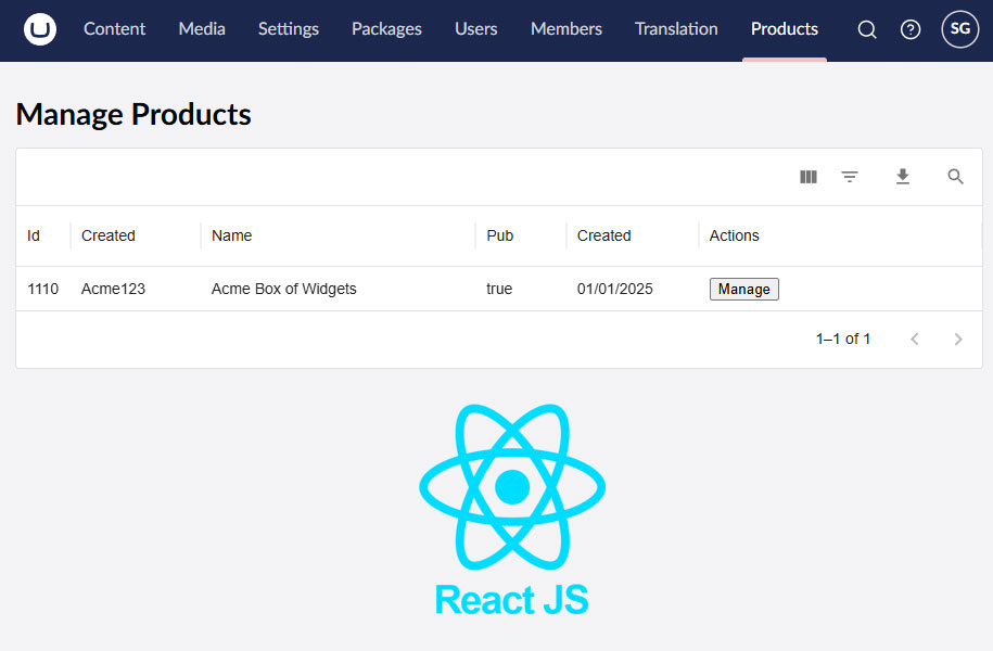
Create a Basic Umbraco Back Office React Component
Step 4 involves the creation of a basic React component for your custom Umbraco v14,15 or 16 back-office section.
The following code utilises a React Data Grid component to create a table to hold products for use in an Umbraco website.
Add this code to your /App_Plugins/products/scripts/product-section.tsx file:
    import React, { useState } from 'react';
import { DataGrid, GridColDef } from '@mui/x-data-grid';

function App() {
    const columns: GridColDef[] = [
        { field: 'id', headerName: 'Id', width: 40 },
        { field: 'sku', headerName: 'Created', width: 120 },
        { field: 'name', headerName: 'Name', flex: 1 },
        { field: 'published', headerName: 'Pub', flex: 1 },
        { field: 'created', headerName: 'Created', width: 80 },
        {
            field: 'actions', headerName: 'Actions', flex: 1,
            renderCell: (params) => (
                < button className="btn btn--icon btn--icon-only material-symbols-outlined">Manage
            )
        },
    ];

    const skus = [
        {
            id: 1110,
            sku: 'acme1234',
            name: 'Acme Box of Widgets',
            published: true,
            created: '01/01/2025',
            type: 'info',
            information: 'Some information about nothing important.'
        },
    ];

    return (
        < div className="psm-products">
            < h1>Manage Products
            < div>
                < DataGrid
                    rows={skus}
                    columns={columns}
                    pageSizeOptions={[5, 10]}
                    disableRowSelectionOnClick
                    disableColumnMenu
                    rowHeight={40}
                    showToolbar
                />


    );
}

export default App;
Get in touch...
Custom Umbraco back office Sections are a great way to integrate internal business systems with your Umbraco website.
If you have this type of requirement then Codebricks can help, so please get in touch for a free, no obligation chat.